JIBELL BI
2024
Brand Identity
Development
for jibell
서울을 기반으로 한 사워도우 전문 브랜드, 지벨의 브랜드 아이덴티티 작업입니다. 단순한 재료를 정직하게 배합하여 완성되는 사워도우처럼, 그래픽 기본 조형들을 결합하여 표현합니다 . 경계를 부드럽게 녹이지 않고 그대로 공존하게 두는 방식으로 결합의 이미지를 전달하며, 장난스러운 투박함을 브랜드 전반에 배치해두었습니다.
This is the brand identity design for ‘Jibell’, a sourdough-focused brand based in Seoul.
Like sourdough—made by honestly combining simple ingredients—the visual identity is constructed by merging basic graphic forms. Rather than softening the edges, we allow shapes to coexist as they are—emphasizing contrast as a core part of composition.
A sense of playful roughness is intentionally placed throughout the brand, capturing Jibell’s unique character.
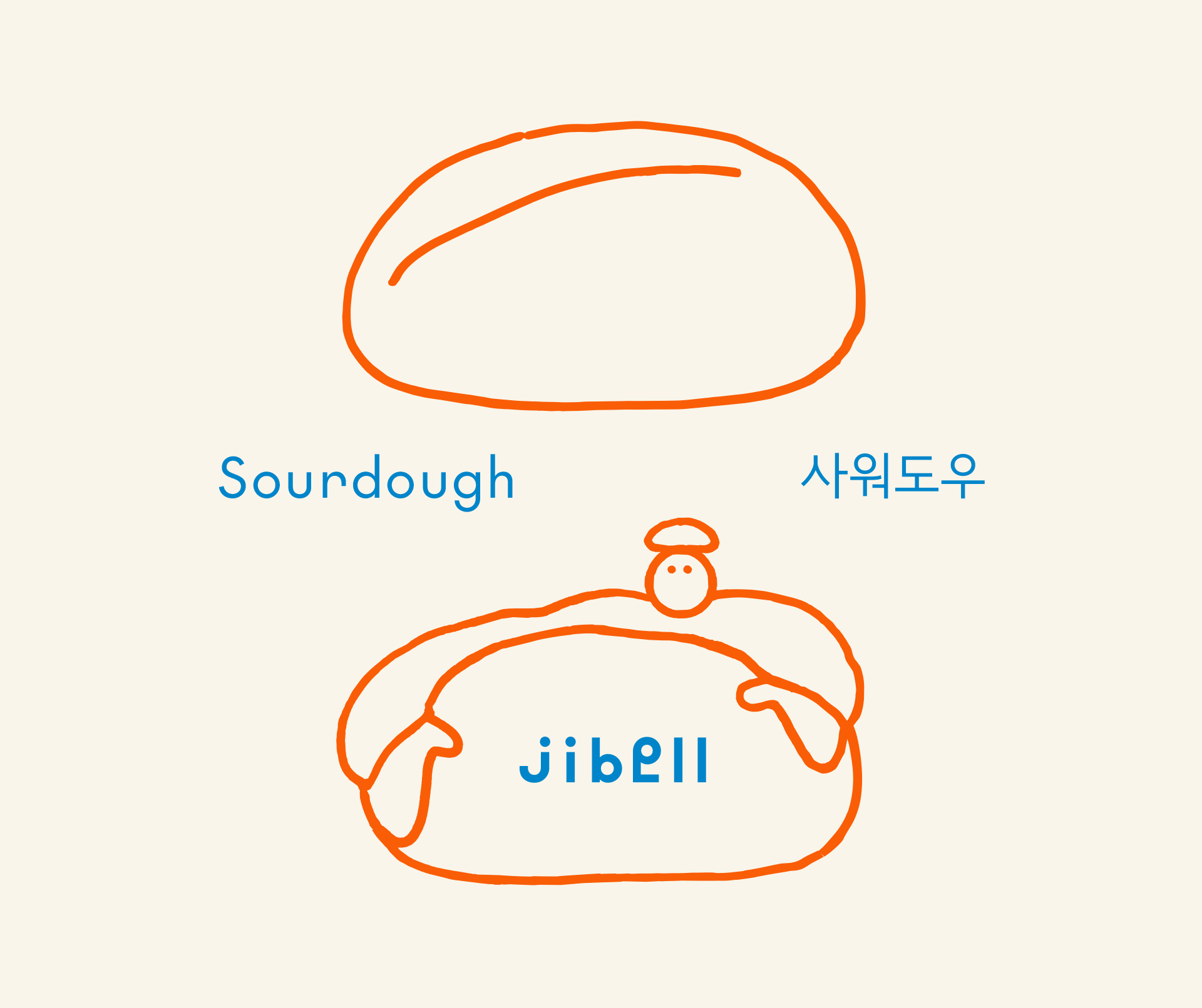
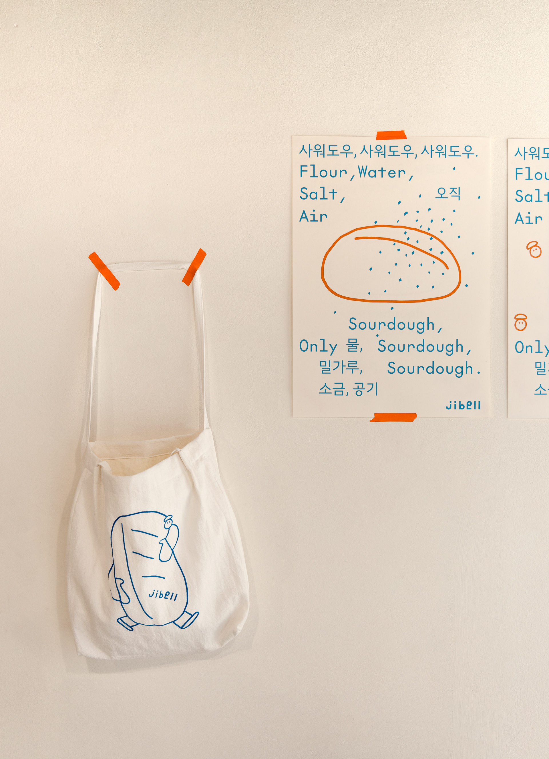
‘지벨’이라는 브랜드명은 오너의 어린시절 별명에 기인합니다. 한국에서 체구가 작은 아이를 귀엽게 부르는 ‘쥐방울'이라는 단어의 ‘방울’을 영어 bell로 변경하여 붙인 말입니다. 한국어로도, 영어로도 읽히지 않고 때로는 불어로 오해되기도 하는 이 독특한 이름은 다양한 문화와 사람들이 와글와글 모여있는 듯한 즐거운 인상을 전달합니다.
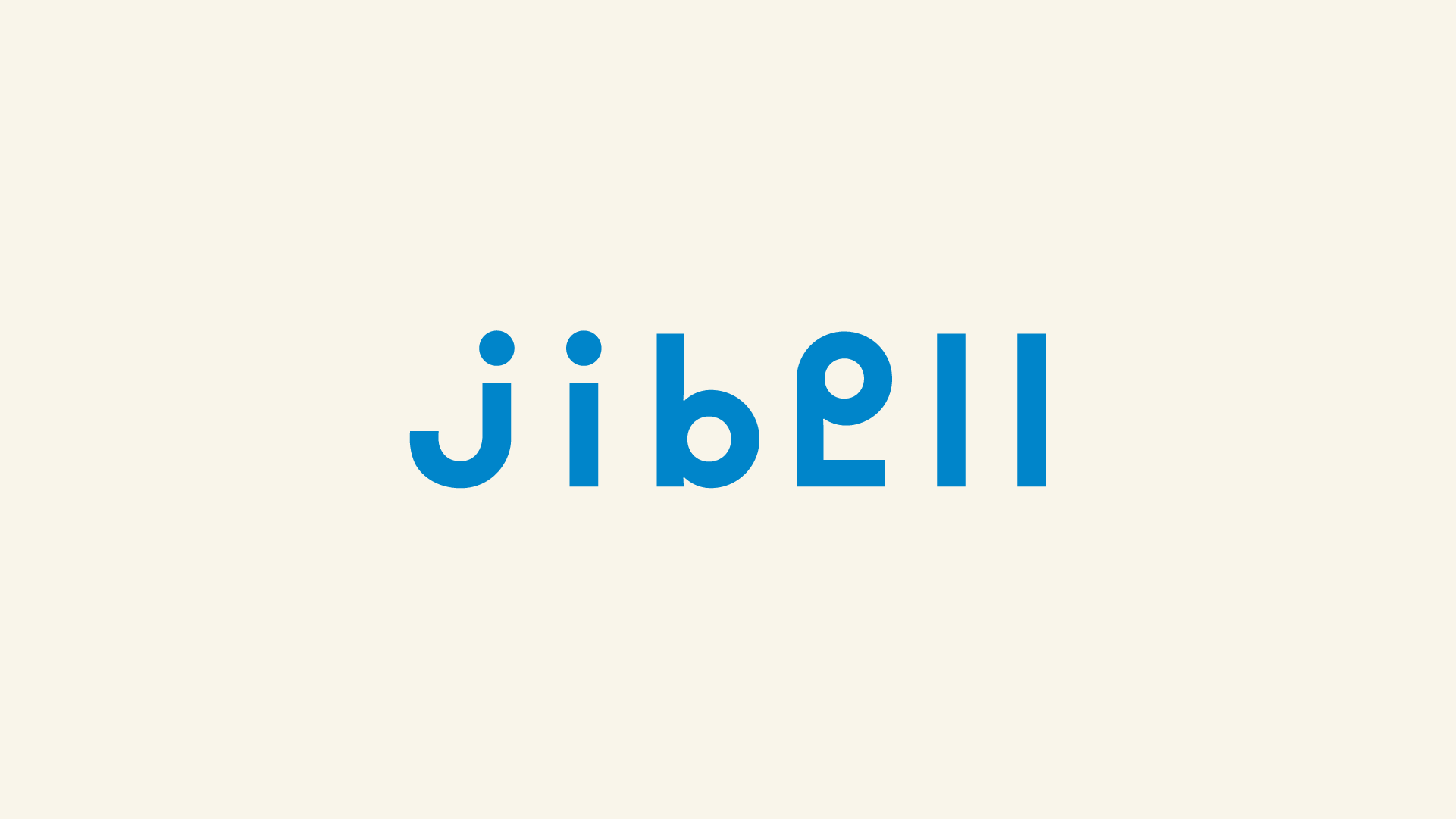
균일한 두께의 도톰한 선과 기하학적인 원 형태의 직관적이고 어색한 부착은, 이 재치있는 언어의 결합을 시각적으로 표현하는 장치입니다. 워드마크 곳곳에 반복되는 원형의 요소 또한 ‘쥐방울’과 bell아이덴티티를 강조합니다.
균일한 두께의 도톰한 선과 기하학적인 원 형태의 직관적이고 어색한 부착은, 이 재치있는 언어의 결합을 시각적으로 표현하는 장치입니다. 워드마크 곳곳에 반복되는 원형의 요소 또한 ‘쥐방울’과 bell아이덴티티를 강조합니다.
The name 'Jibell' comes from the owner’s childhood nickname. It’s a playful twist on the Korean word 쥐방울 jwibang-ul—an affectionate term for someone small and cute—where 방울 bang-ul (meaning 'bell' or 'bubble') is replaced with the English word 'bell.' The result is a name that doesn’t quite read as Korean or English and is often mistaken for French. This ambiguity creates a sense of joyful mischief, as if different cultures and voices are playfully mingling in one space.
The use of thick, uniform lines and awkwardly attached geometric circles visually reflects this witty linguistic blend. Recurring circular motifs in the wordmark subtly reinforce the combined identity of 'jwibang-ul' and 'bell.'
The use of thick, uniform lines and awkwardly attached geometric circles visually reflects this witty linguistic blend. Recurring circular motifs in the wordmark subtly reinforce the combined identity of 'jwibang-ul' and 'bell.'
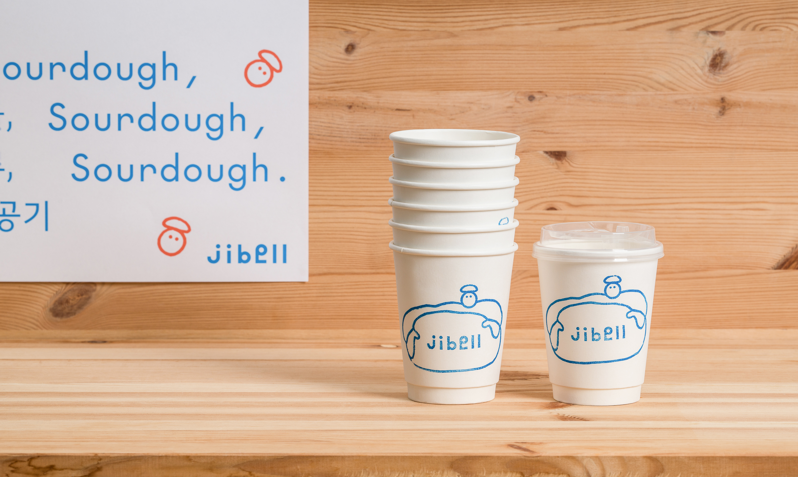
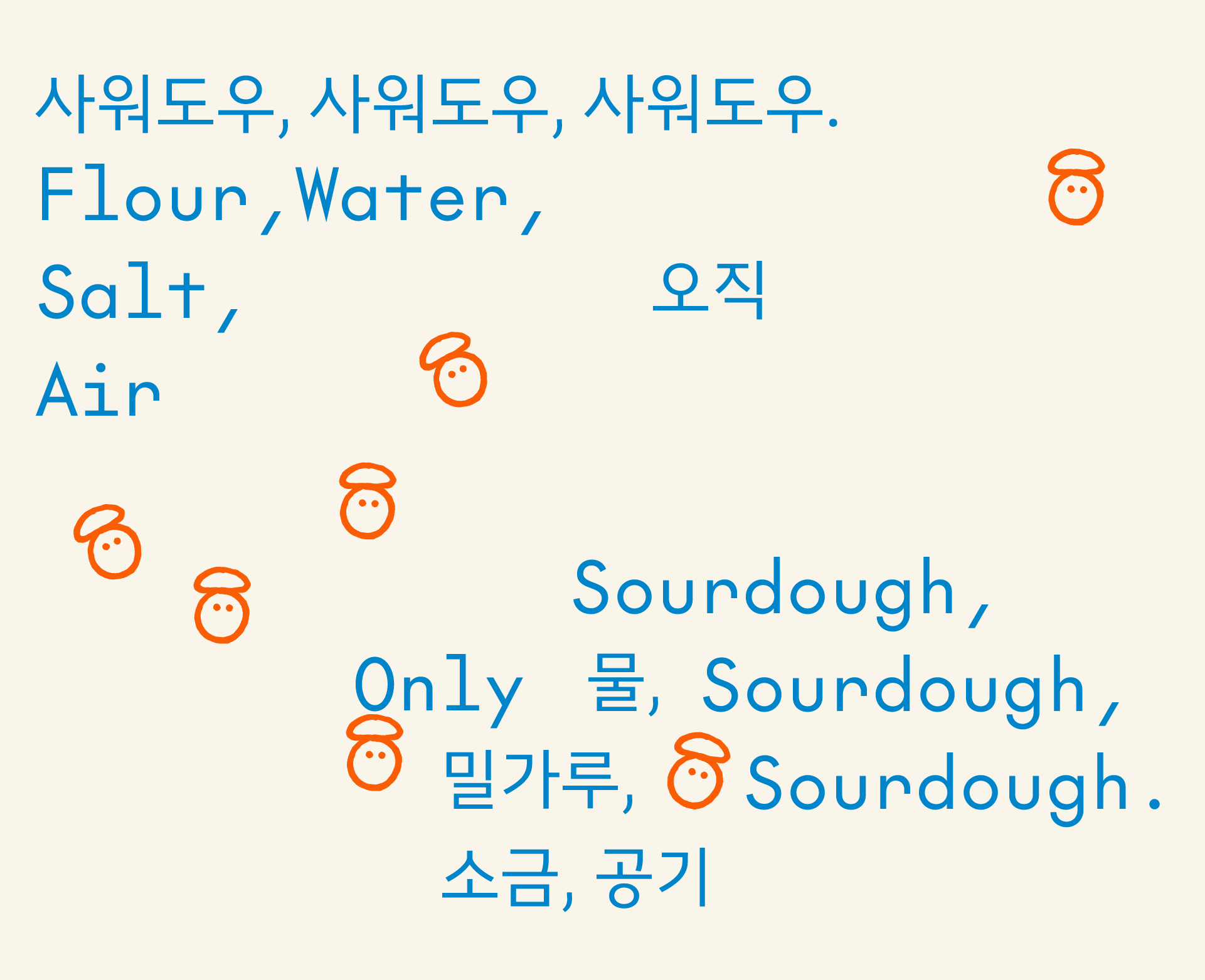
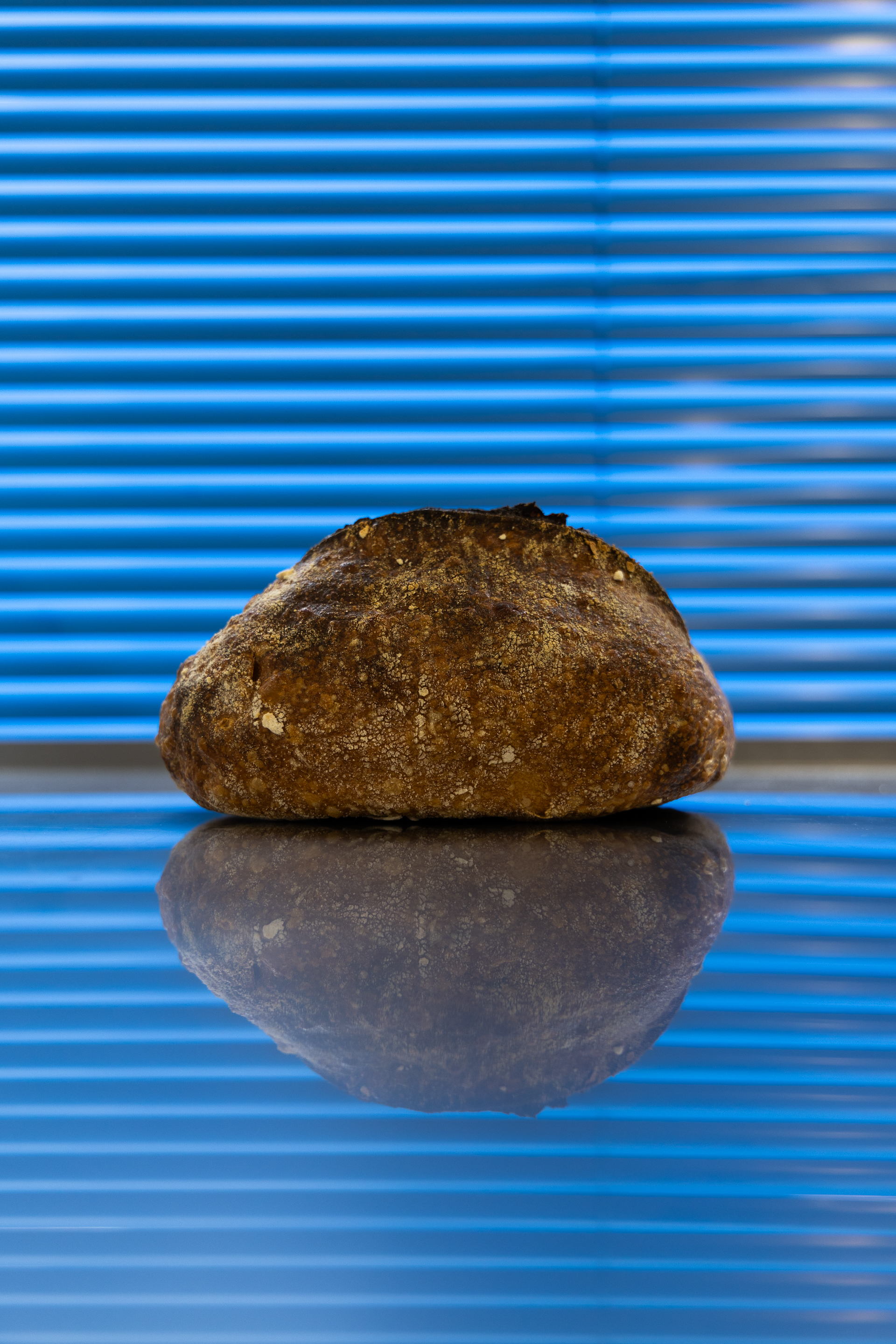
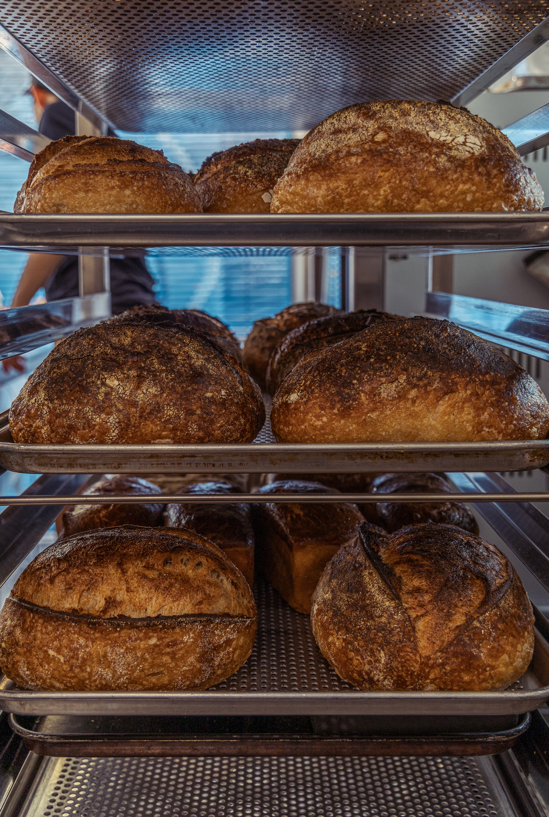
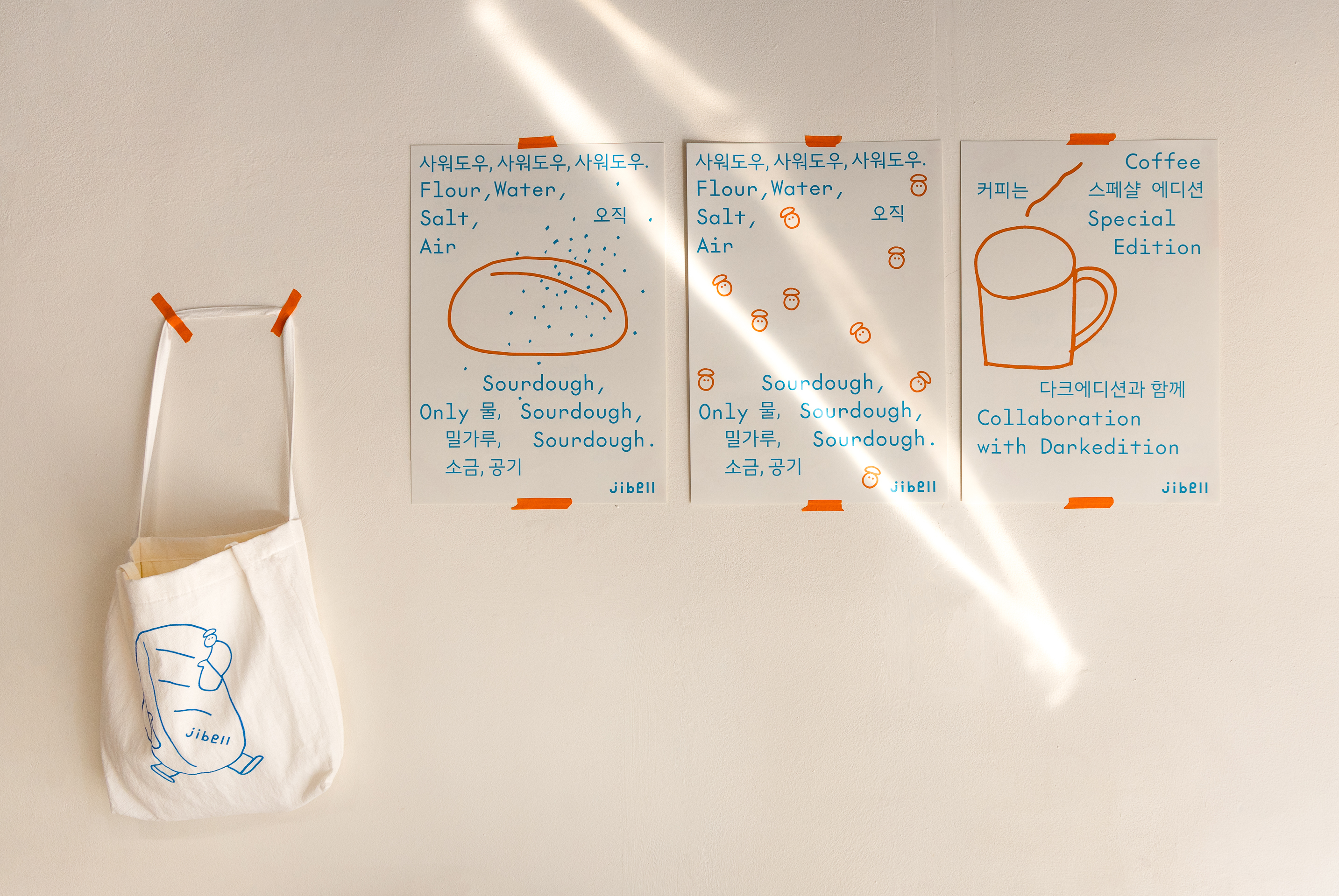
사워도우 빵은 필연적으로 그 빵이 구워지는 곳의 기후와 공기에 영향을 받으며, 로컬의 특성과 밀접하게 결합합니다. code-switching 형식으로 발화하듯 배치된 타이포그래피는 이 결합을 표현하는 또다른 방식이며, 한국어와 영어가 동일한 의미이거나 의역된 표현으로 섞어 배치됩니다. 산세리프의 기하학적인 서체 또한 원형의 요소를 내포하고 있습니다
Sourdough bread is inevitably shaped by the climate and air of the place where it’s baked — it becomes deeply rooted in the characteristics of its locality.
The typography, laid out in a manner reminiscent of code-switching, reflects this sense of fusion. Korean and English expressions are interwoven, often sharing meanings or acting as loose translations of one another.The geometric sans-serif typeface also carries subtle circular elements, further echoing the visual identity of Jibell.
The typography, laid out in a manner reminiscent of code-switching, reflects this sense of fusion. Korean and English expressions are interwoven, often sharing meanings or acting as loose translations of one another.The geometric sans-serif typeface also carries subtle circular elements, further echoing the visual identity of Jibell.


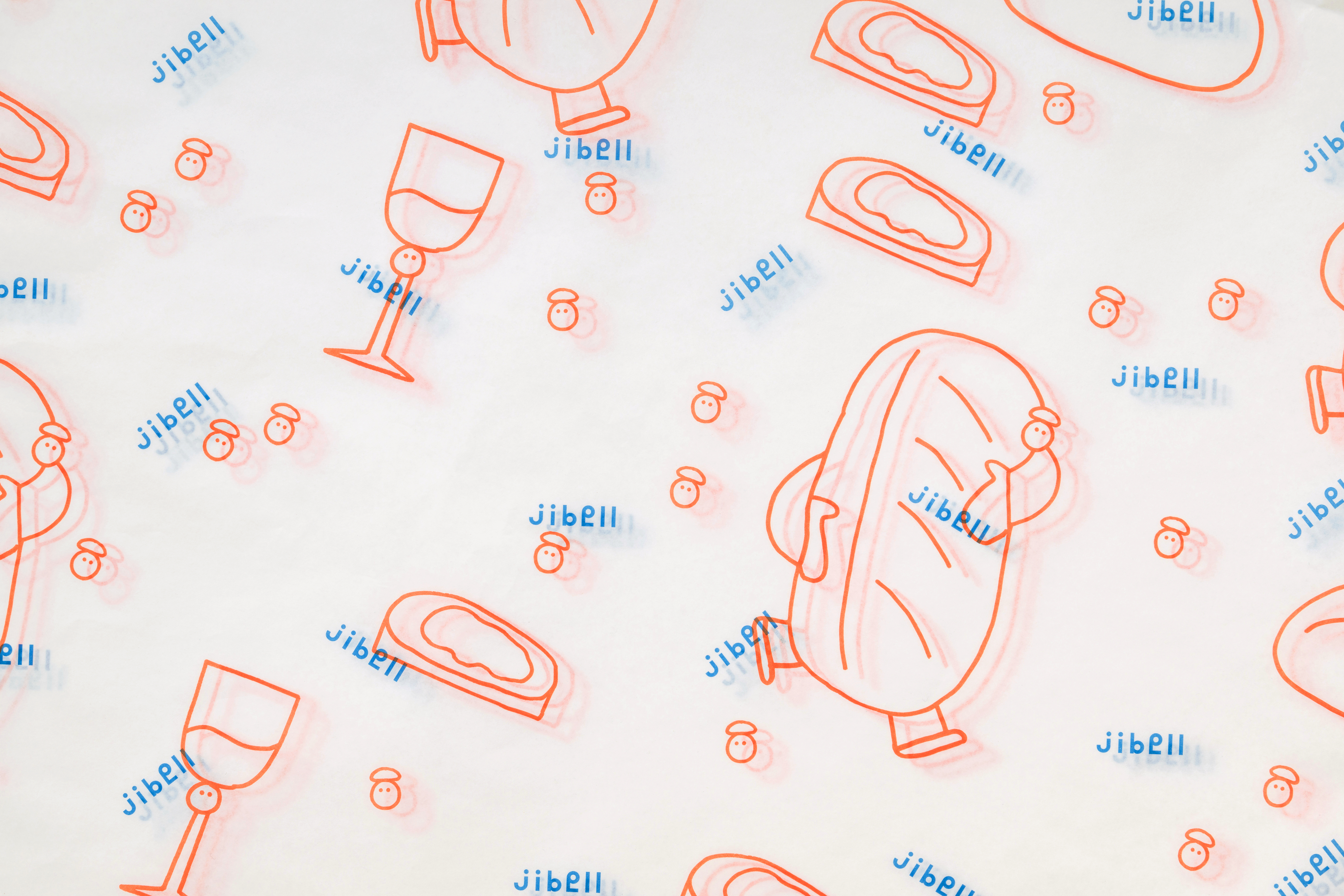
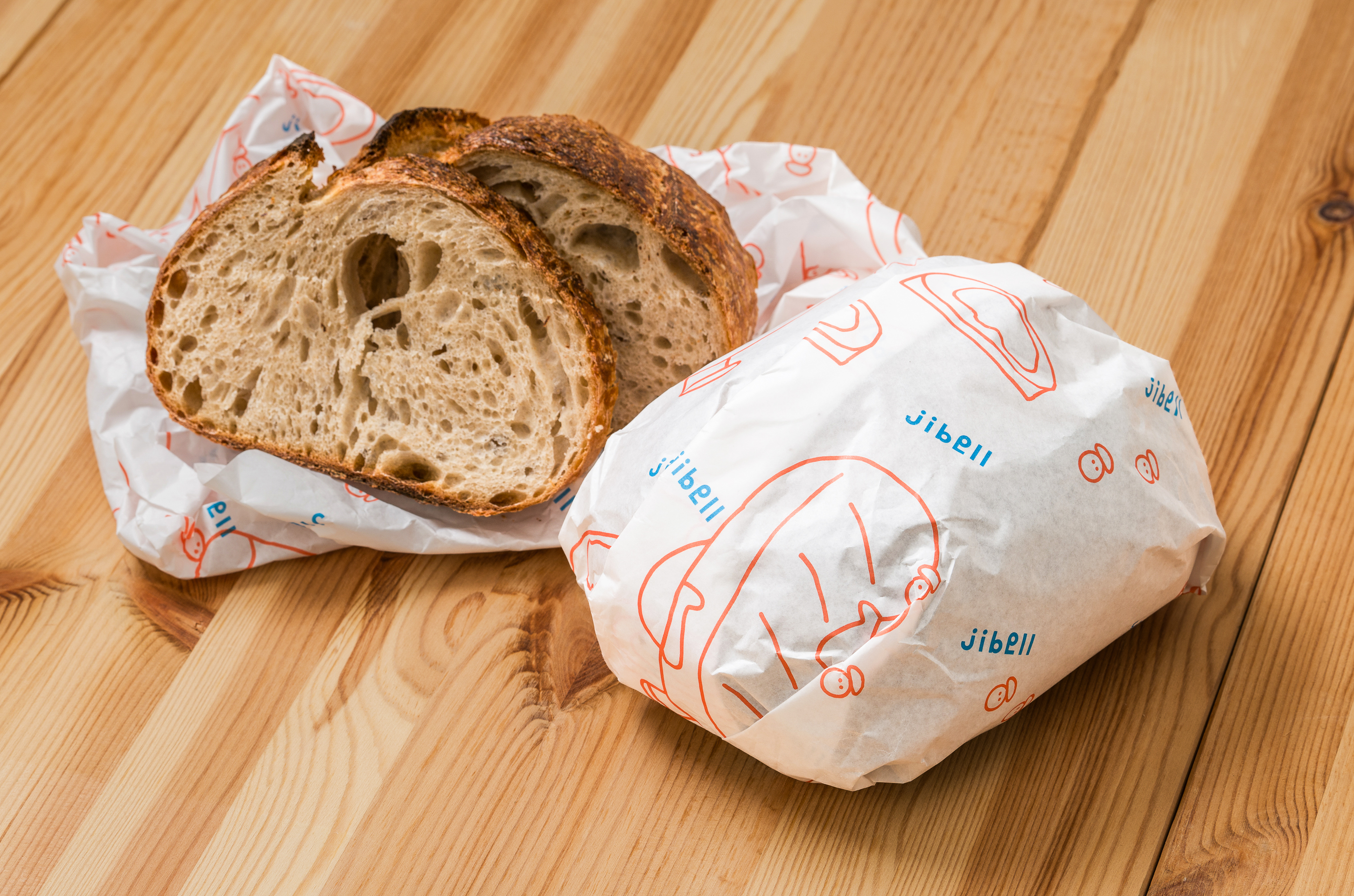
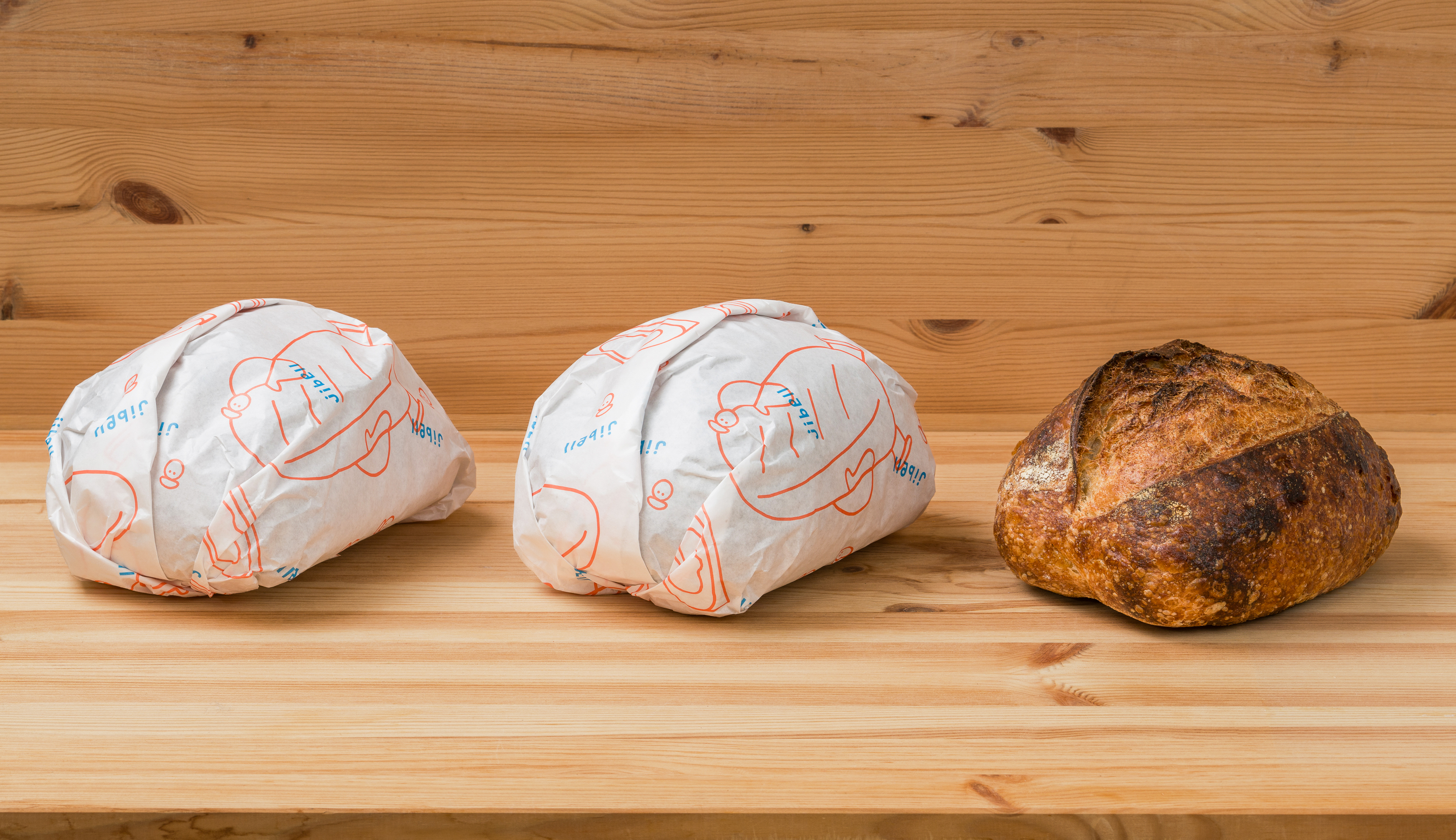
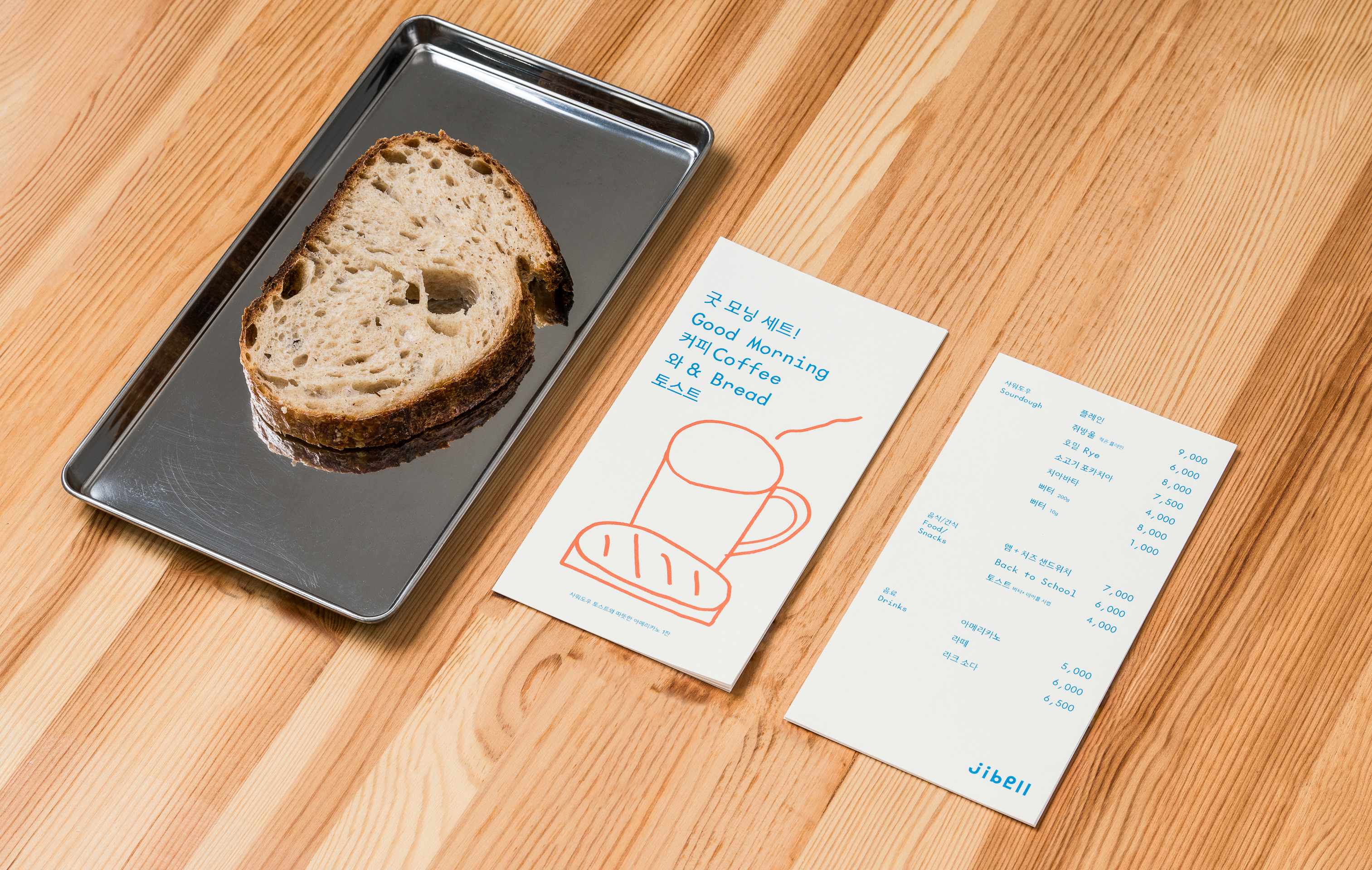
일러스트는 두툼한 펜으로 가볍게 슥슥 그린 듯한 인상으로 작업되었습니다. 빵을 얹고 있는 작고 동그란 얼굴은 빵을 만드는 baker를 의미하며, 때로는 밀가루 입자나 작은 공기 입자처럼 느껴지기도 합니다. 확장되어 활용되는 경우, 쥐방울이라는 이름처럼 원은 작게, 빵은 크게 표현하여 ‘jibell이 품은 거대한 빵의 세계’를 은유적으로 전달합니다. 빵이 등장하지 않는 그래픽에도 원형의 요소를 반복적으로 등장시켜 일관성을 유지합니다.
The illustrations are drawn in a way that feels light and spontaneous, as though quickly sketched with a thick pen. The small, round face holding the bread represents the baker—but it can also be seen as a particle of flour or even a tiny bubble of air. In extended applications, the circle becomes smaller and the bread larger, metaphorically expressing “the massive universe of bread embraced by Jibell.”
Even in graphics where bread is absent, repeated use of circular motifs ensures visual consistency and reinforces the brand identity.
Even in graphics where bread is absent, repeated use of circular motifs ensures visual consistency and reinforces the brand identity.


JIBELL Brand Identity Design
Client: JIBELL
2024
BI Design: m3m (Minsun Lee)
Portfolio Photography: Jinsol Kim
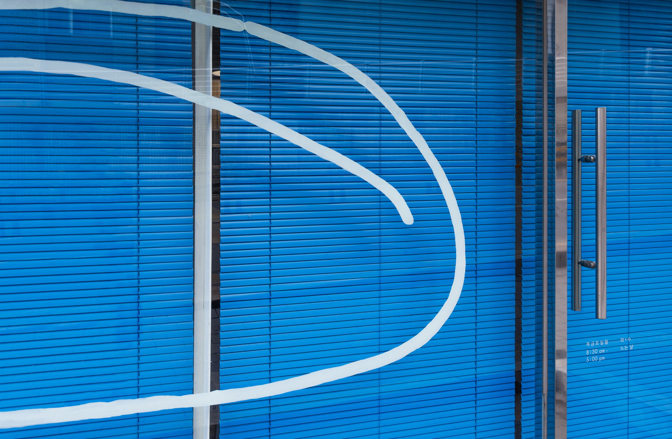
Space Photography: m3m