HOWOL BI
2023
Brand Identity Development for HOWOL
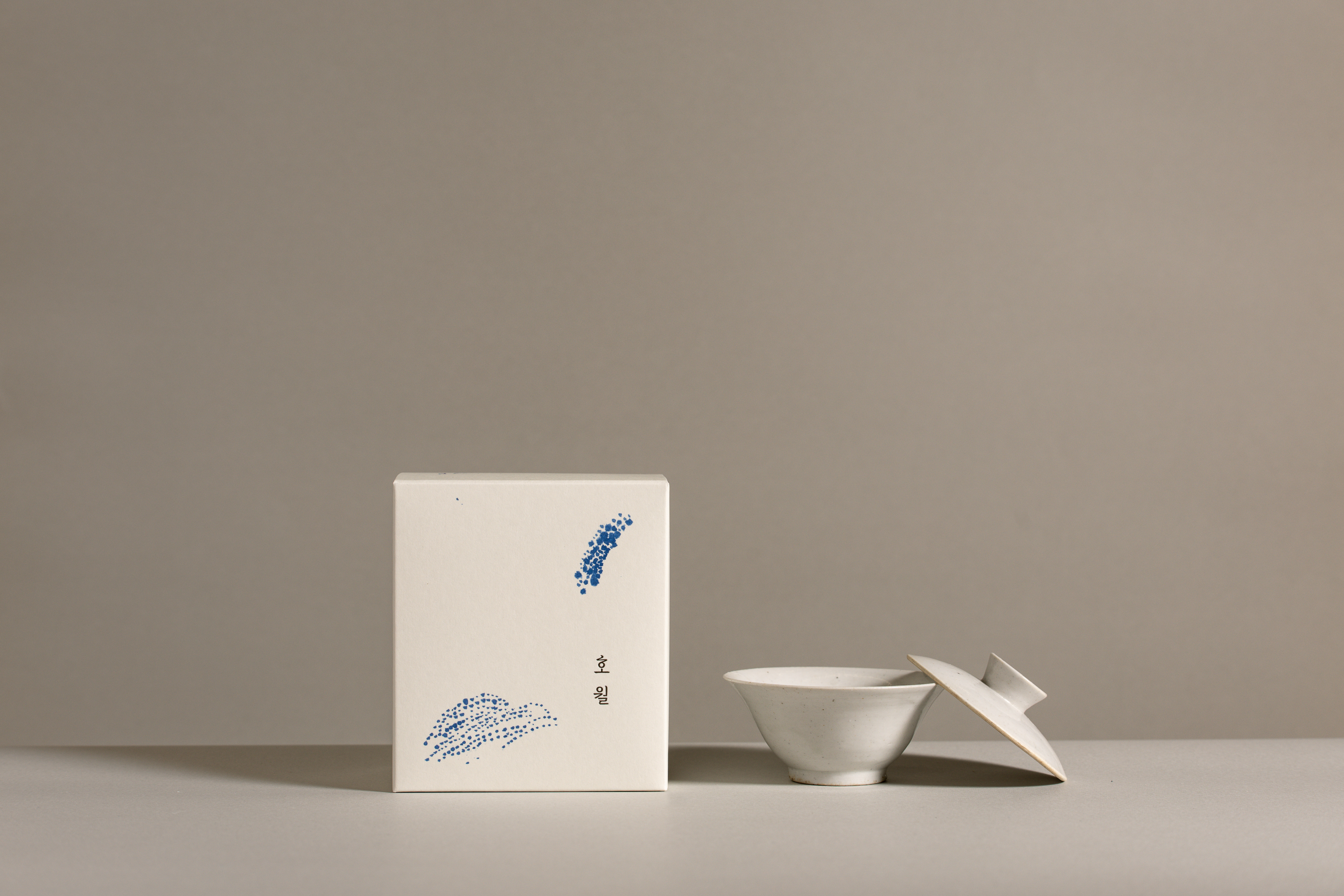
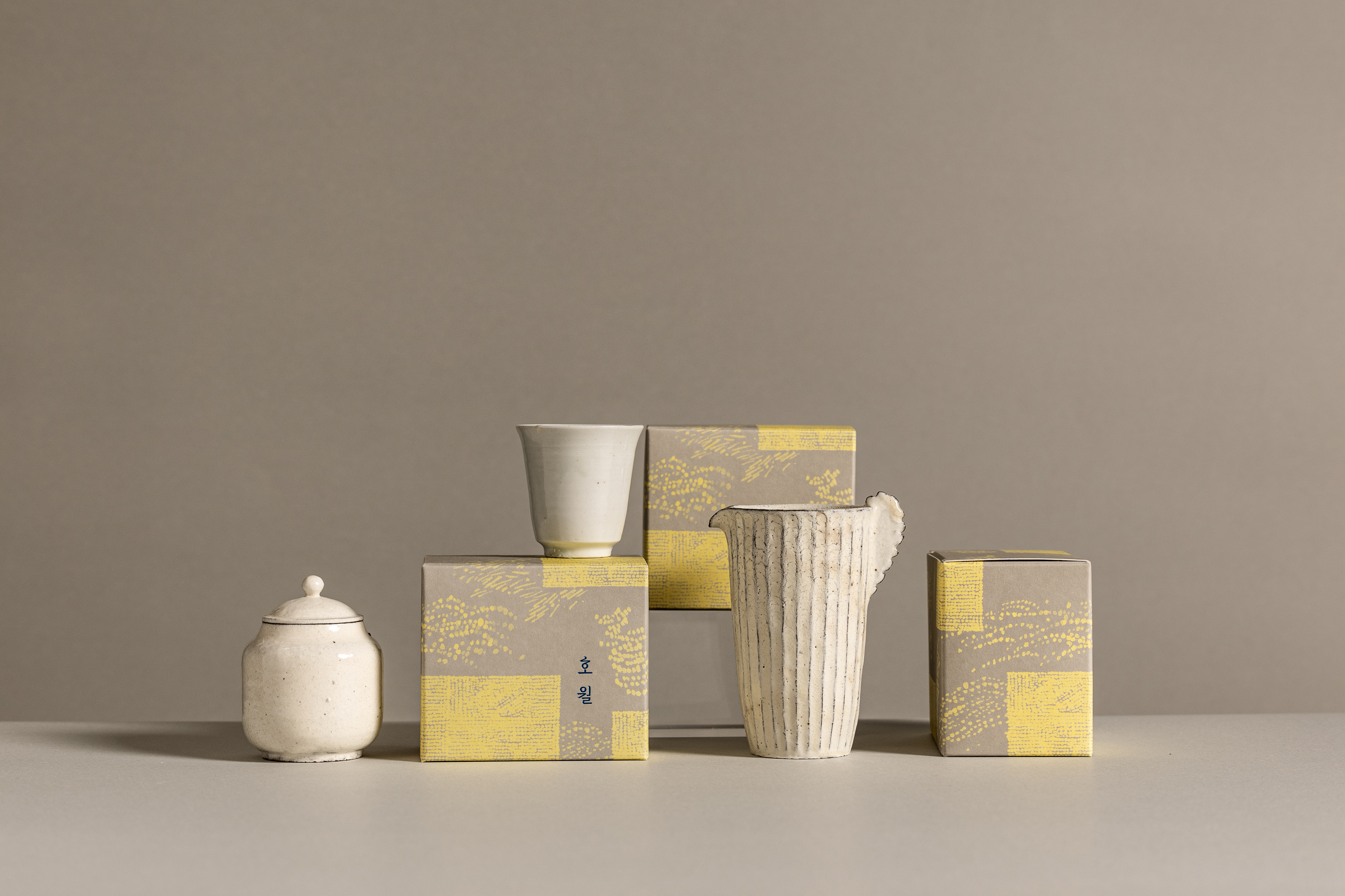
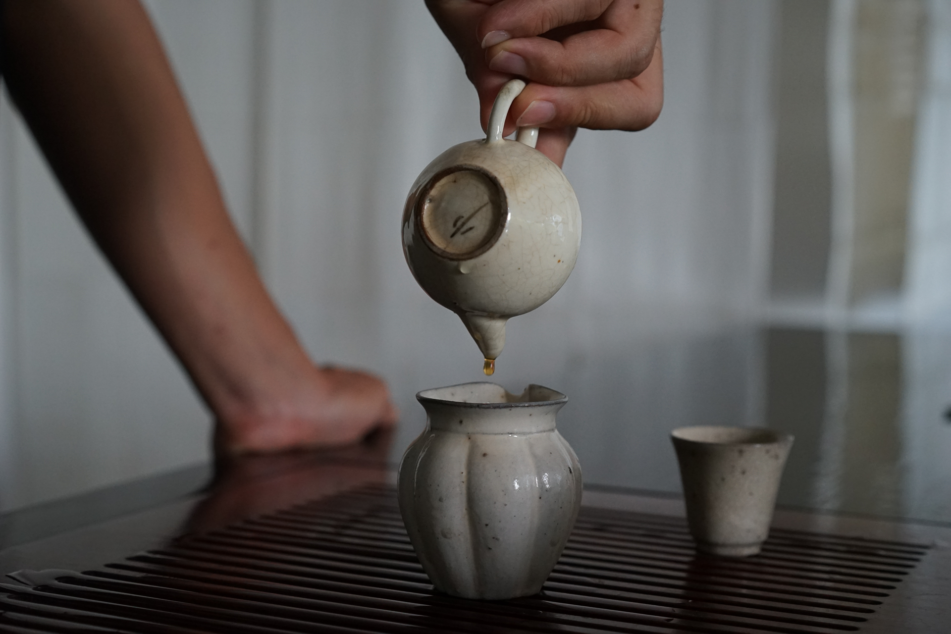
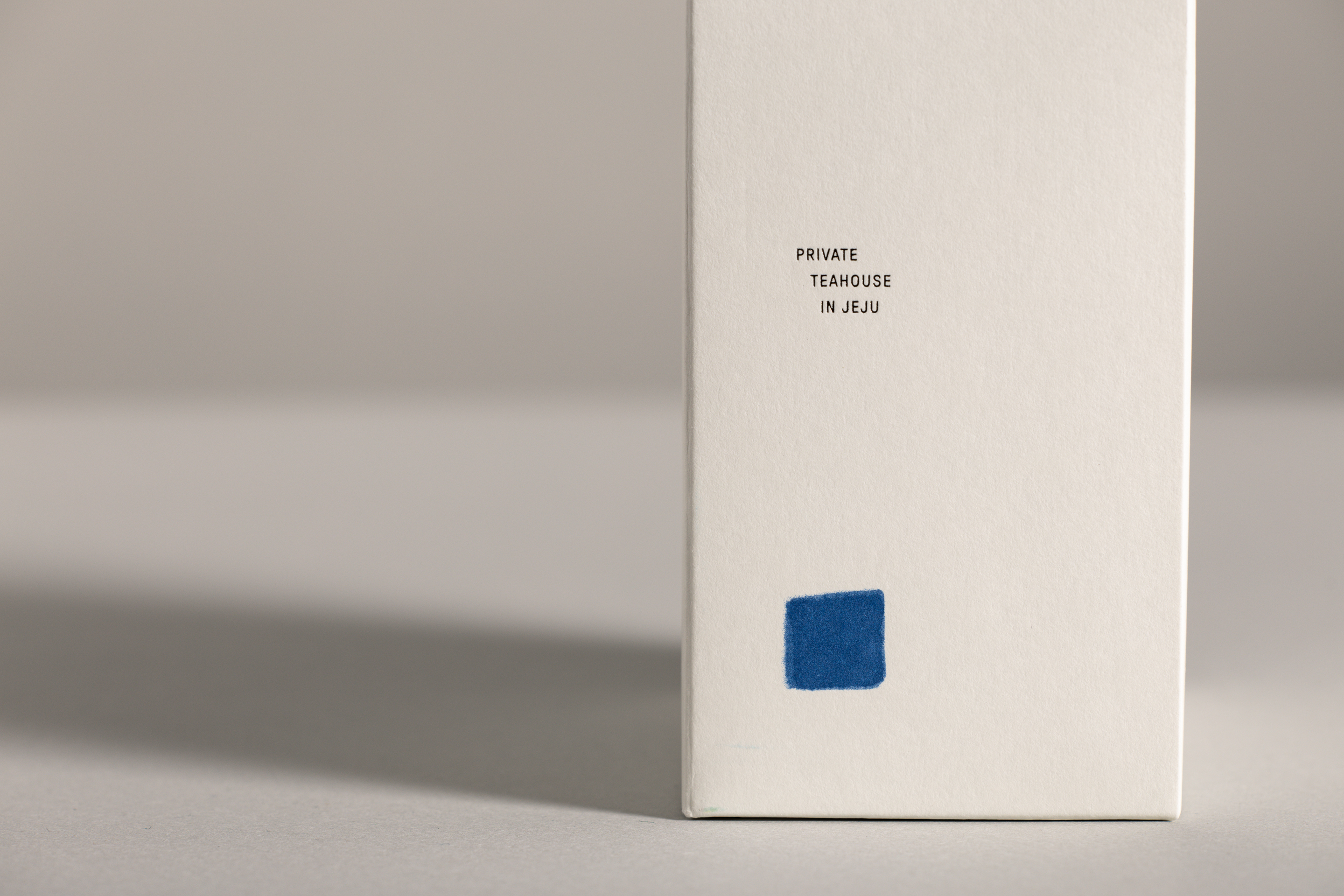
호월은 제주도에 위치한 프라이빗 다실로 한국 및 동아시아의 차와 공예품을 한국적인 미감으로 소개합니다. 호월은 '호수에 비친 달'이라는 뜻으로 찻잔에 둥근 조명이 비치는 것이 마치 달처럼 느껴져 지어진 이름입니다. 이름에 담긴 달의 심상과 차실의 위치, 공간적 특성을 강화하여 비주얼 아이덴티티를 개발하였습니다.
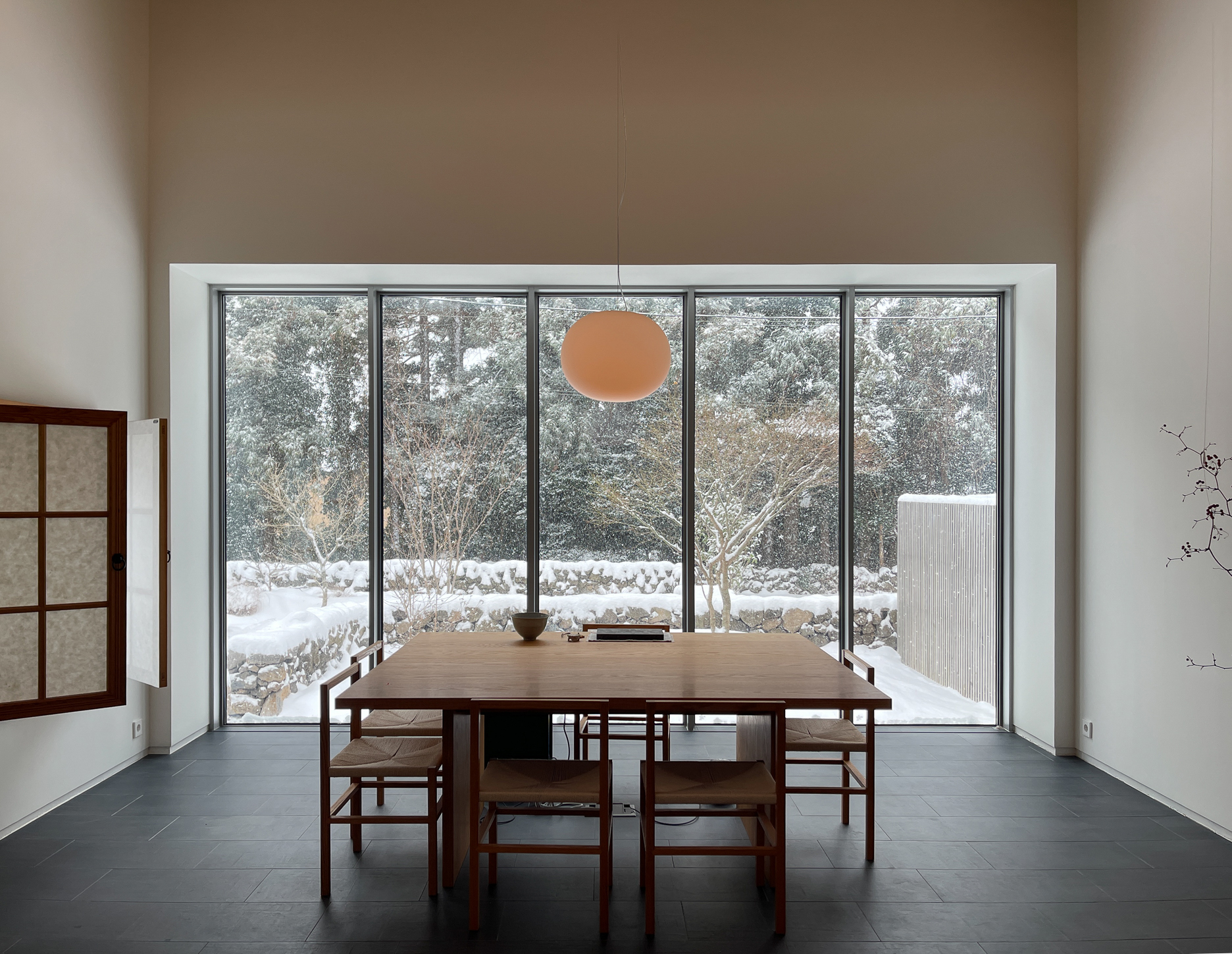
HOWOL is a private tea house located in Jeju, Korea, that presents Korean and East Asian teas and crafts with a distinct Korean aesthetic. The name "HOWOL," which means "The Moon Reflected on the Lake," is inspired by the image of a round ceiling light reflecting on a tea cup.
The visual identity was developed to reinforce both the symbolic moon imagery and the unique spatial characteristics of the tea room.
The visual identity was developed to reinforce both the symbolic moon imagery and the unique spatial characteristics of the tea room.
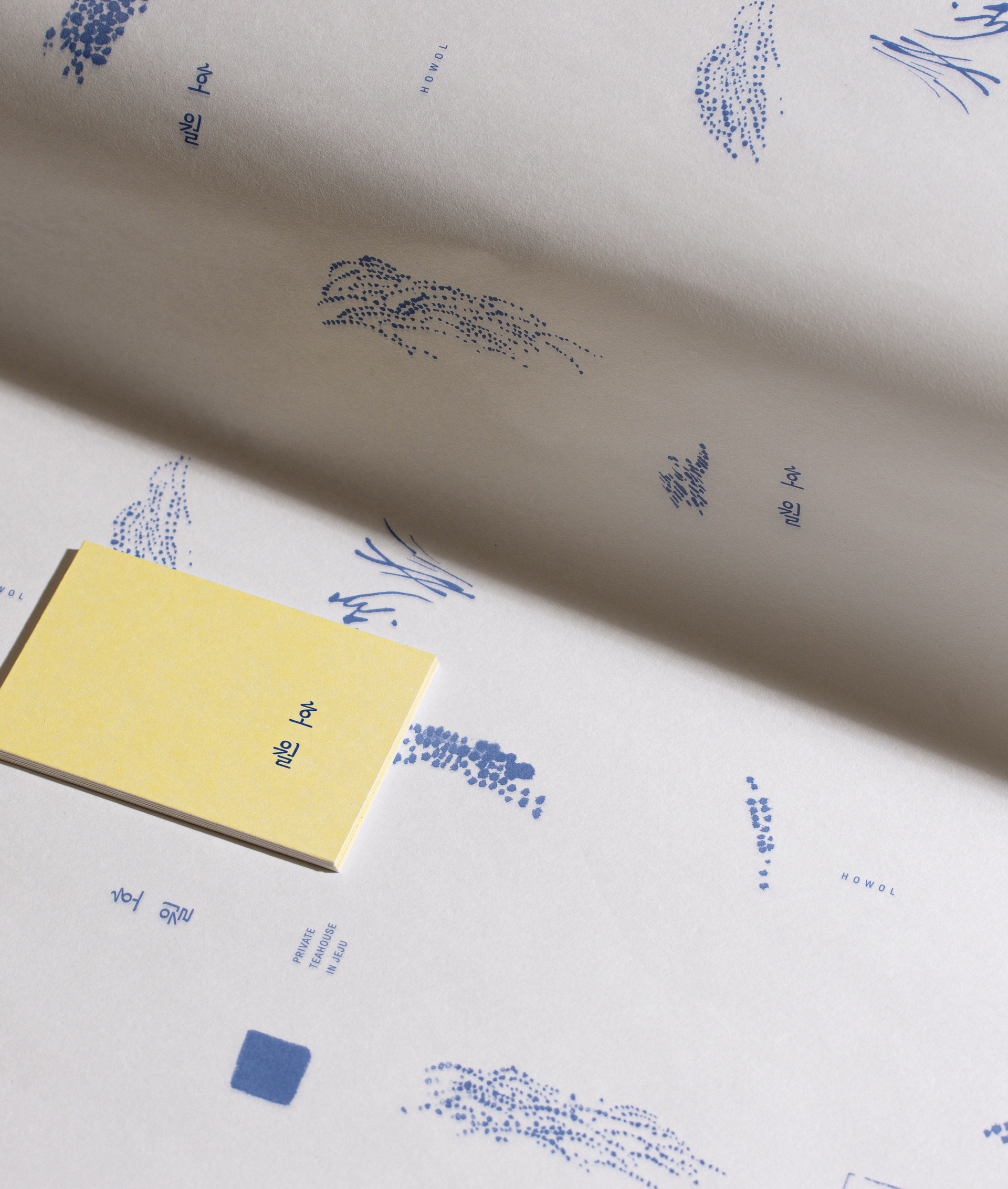
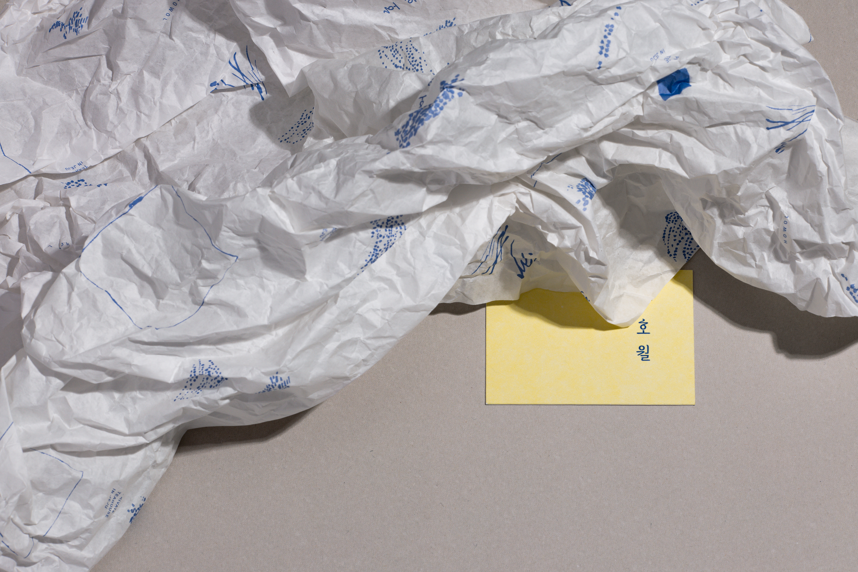
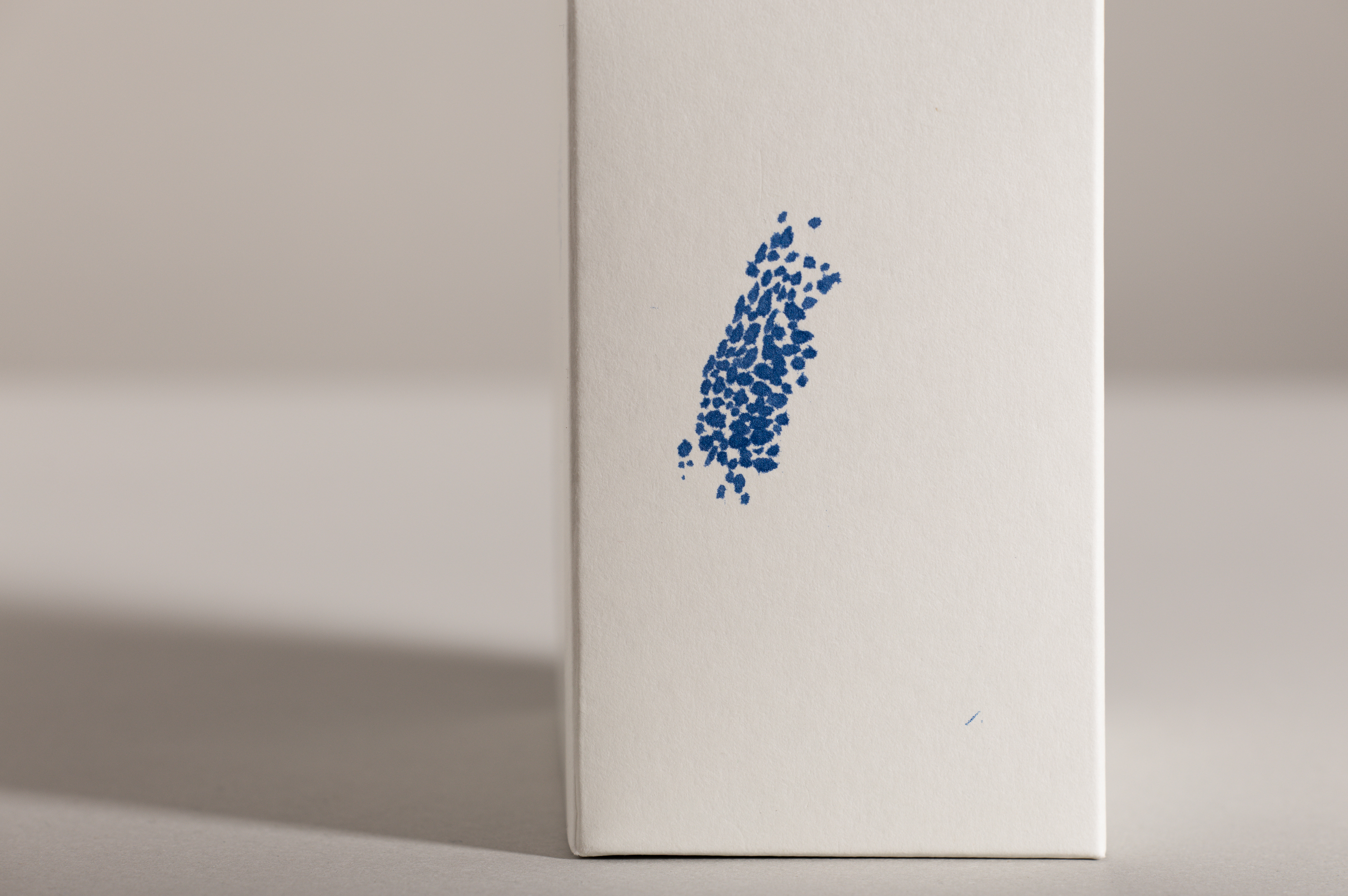
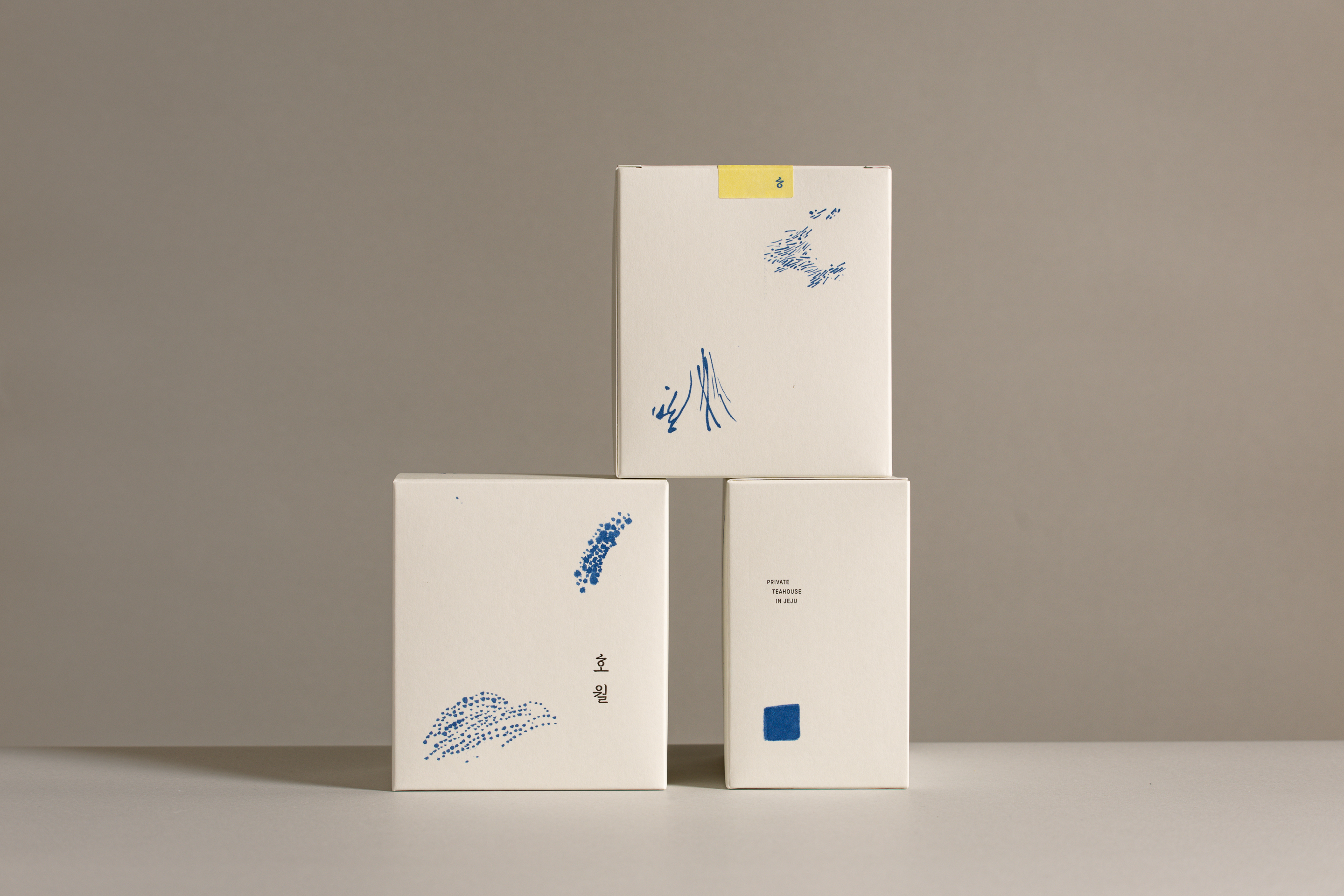
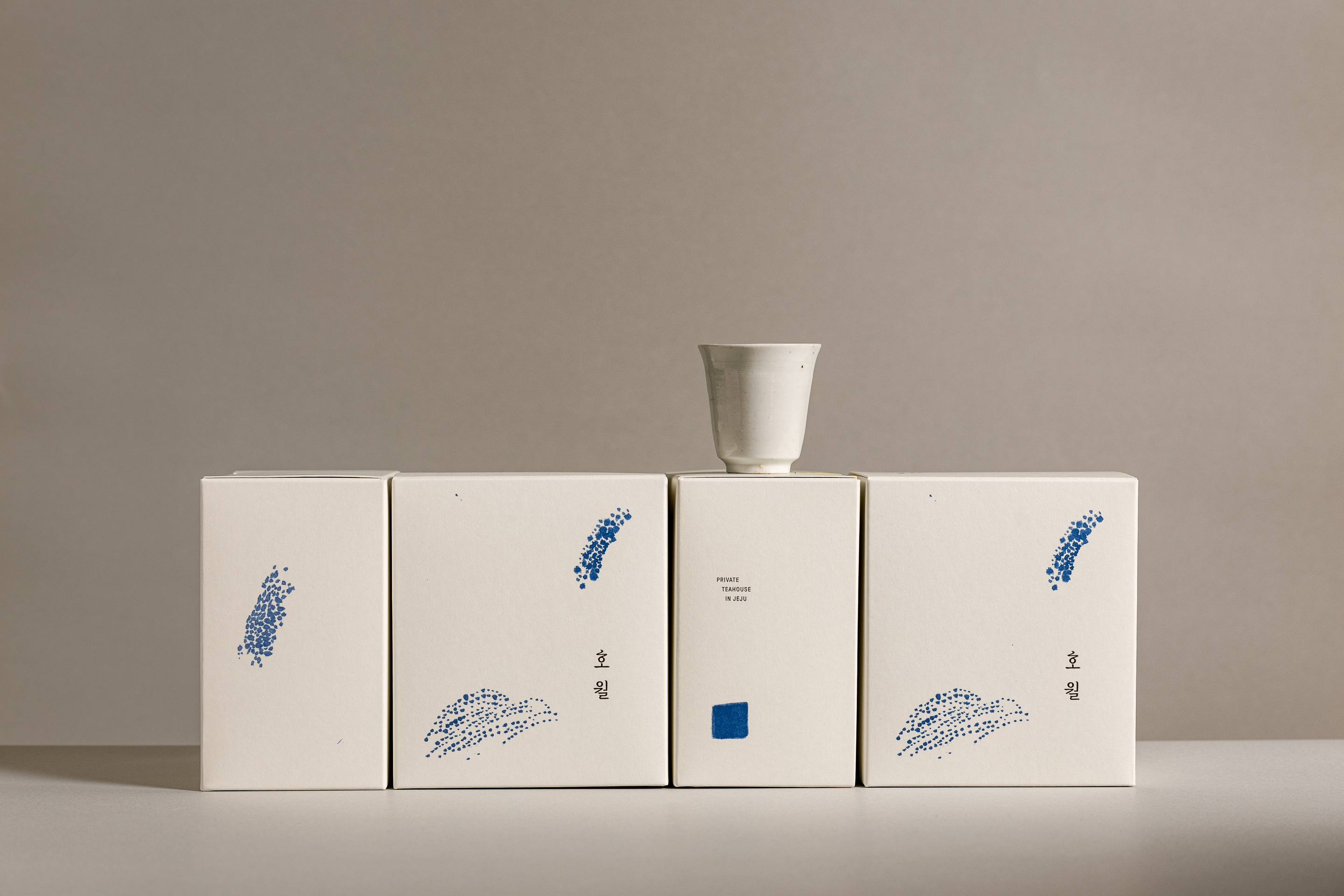
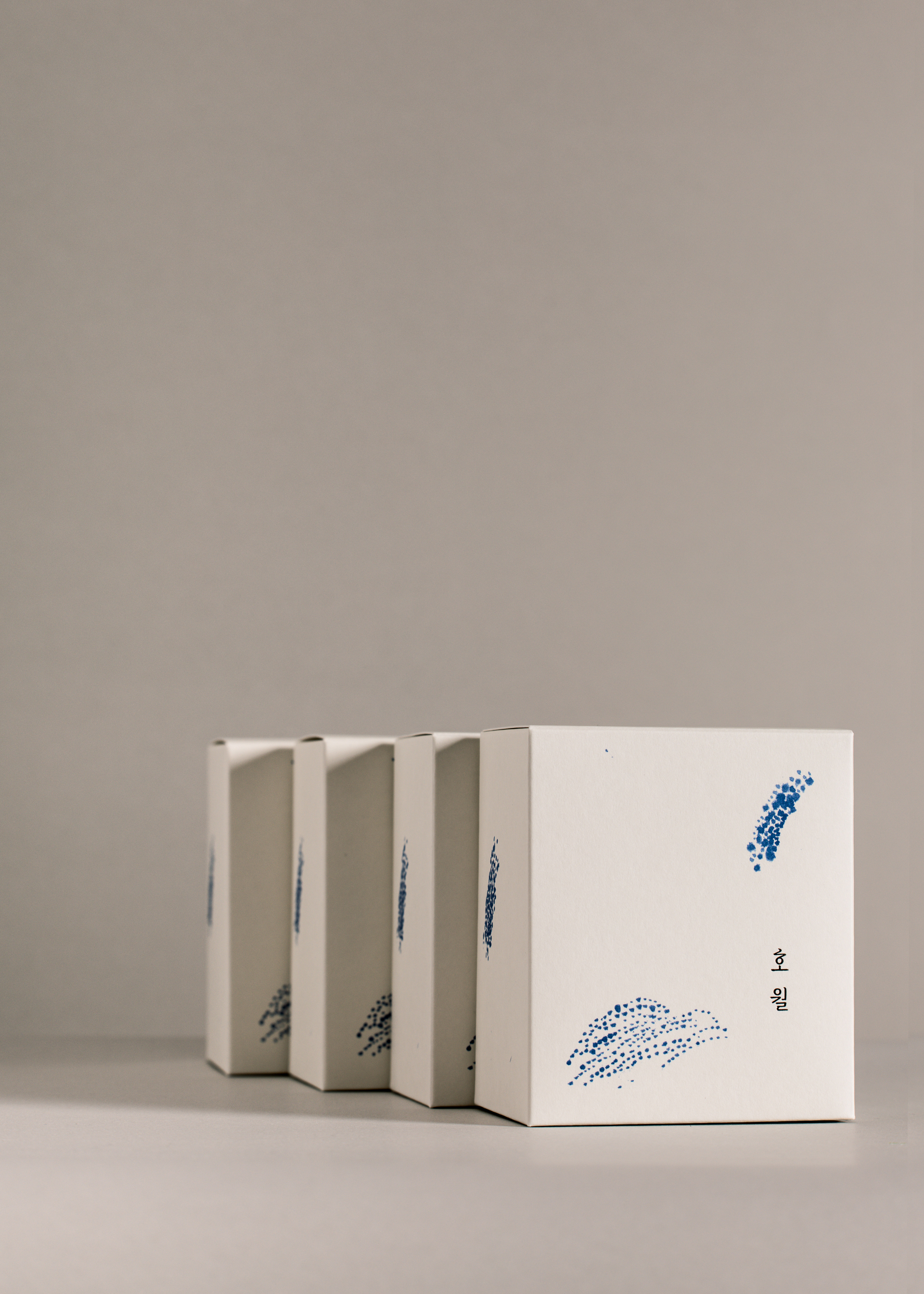
동양화 기법인 ‘홍운탁월’을 재해석하여. 달빛의 색상, 은은하
게 부유하는 그래픽들, 흐르는 듯한 워드마크로 브랜드 곳곳에서 은유적으로 달의 이미지를 전달합니다. (烘雲托月: 직접 달을 그리지 않고, 주변의 것을 그려 달을 표현하는 회화 기법)
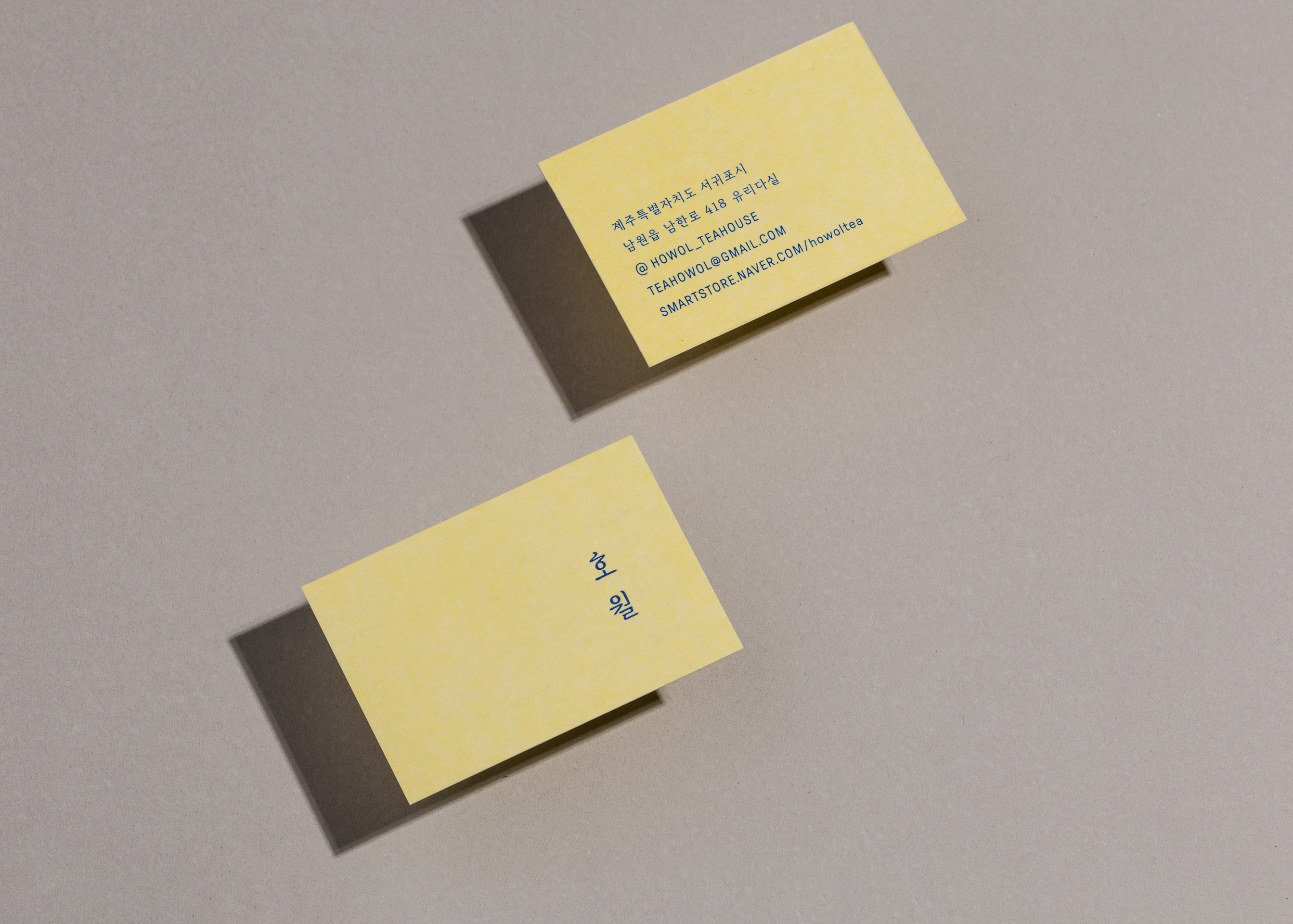
로고타입은 정성스럽게 쓰여진 명조체의 단정함을 추구하되 무겁지도, 가볍지도 않게 다듬어 편안한 환대의 인상을 담았습니다. 브랜드의 개성이 느껴지도록 ‘히읗’의 형태에 물결에 흔들리는 달의 이미지를 녹여 표현하고, 이를 기반으로 한 심볼을 함께 활용합니다
게 부유하는 그래픽들, 흐르는 듯한 워드마크로 브랜드 곳곳에서 은유적으로 달의 이미지를 전달합니다. (烘雲托月: 직접 달을 그리지 않고, 주변의 것을 그려 달을 표현하는 회화 기법)
로고타입은 정성스럽게 쓰여진 명조체의 단정함을 추구하되 무겁지도, 가볍지도 않게 다듬어 편안한 환대의 인상을 담았습니다. 브랜드의 개성이 느껴지도록 ‘히읗’의 형태에 물결에 흔들리는 달의 이미지를 녹여 표현하고, 이를 기반으로 한 심볼을 함께 활용합니다
The brand’s visual identity draws from the traditional Eastern painting technique Hongun Takwol (烘雲托月), where the moon is not depicted directly, but instead suggested through surrounding elements. The color of moonlight, the floating graphics, and the flowing wordmark subtly convey the image of the moon throughout the brand.
The wordmark is crafted using a refined Myeongjo(serif) typeface, achieving a balance that is neither too heavy nor too light, evoking a sense of warm hospitality. To express the brand's unique personality, the first character ‘ㅎ’ is stylized with a wave-like curve, symbolizing the moon reflected on gently rippling water, which is also represented in the logo.
The wordmark is crafted using a refined Myeongjo(serif) typeface, achieving a balance that is neither too heavy nor too light, evoking a sense of warm hospitality. To express the brand's unique personality, the first character ‘ㅎ’ is stylized with a wave-like curve, symbolizing the moon reflected on gently rippling water, which is also represented in the logo.


HOWOL Brand Identity Development
Client: HOWOL
2023
BI Design: m3m (Minsun Lee)
Space Photography: Howol
Portfolio Photography: m3m
www.m3m.work
Client: HOWOL
2023
BI Design: m3m (Minsun Lee)
Space Photography: Howol
Portfolio Photography: m3m
www.m3m.work